
Interview | NATASHA MICHAELS
Natasha Michaels is an artist living and working in London. In 2022, she was awarded the Ushaw Residency & Acquisition Prize at Woolwich Contemporary Print Fair. Her artwork is held in private and public collections. Over the years, her illustration has been commissioned by the likes of Penguin Books, Vintage, Random House, The Guardian, and Blue Source.
Natasha Michaels’ artworks play with tensions in the pleasure and power of looking at paintings. Part cartoon, part old masters, her figures are cast with large peering eyes and often uncomfortable in their reimagined surroundings. Through slips and smears of the uncertain surface of the monotype, her works are given agency beyond the passive surface, both materially and conceptually. Art history is both revered and subverted in Michaels’ world of fine art and pop culture.
Could you start by introducing yourself to our readers who might not be familiar with you and your practice?
I studied at Central St Martins and then the Royal College of Art. I studied Communication Design and then specialised in Illustration. I spent almost all my time in the print room. From the moment I discovered print, which was on my Foundation Course, I was just drawn to it. Early on I really struggled with reconciling colour and line, and I think print was one of the ways that helped me to reconcile this. For me, print was the only way of making work.
I make reinterpretations of old masters using the medium of print. I nearly always create monoprints. I'm usually trying to get to grips with the actual painting itself. For example, with a portrait, I'm trying to re-imagine them as a fictional character and bring them to life. I'm imagining them doing things other than what they're originally intended for, living another life that the original painter hasn't incorporated into the painting.
The other day, I was thinking about Andy Warhol and his portraits. He would very simply sit someone down in front of the camera, he would leave the room, and they would just sit there wondering what they were supposed to be doing. They're feeling very uncomfortable and, in some ways, you’re getting more of a portrait of them because Warhol is not there. I feel like there's a similarity in intention in the prints I’m creating. I’m imagining them as if I'm also not there and they've become their own thing.

Teen (portrait of a young man), 2022, Monotype, 43 x 32 cm, Unique work
ThE shift away from illustration and TOWARDS fine art, was that always part of your practice or was there a specific moment in time that contributed to thIS?
I grew up around fine art. My brother is a fine artist and my mum studied fine art. At the age of 19, I didn't want to go in that direction and pursued graphics. But in the end, it just slipped back in again. I left college in 1996, I was an illustrator making book covers and I also was a filmmaker for 15 years, co-directing music videos with my sister. The most interesting bit on set for me was when we’d say cut and I’d look over at the actors, who would be sitting in the same way that I was talking about in the Andy Warhol films. I really feel like that has fed into everything I'm doing now.
Once I had my second child it became almost impossible to do this because you were away for weeks at a time. So I ended up going back more towards illustration. When my youngest was one, I would only be able to grab a couple of hours and I spent my time drawing. Something just pulled me back into drawing and then strangely enough, Penguin called me up and said, “remember those book covers that you did for us 20 years ago? We're doing another three.” And so I went back to print. This was back in 2016. I had been doing all my making in my tiny room upstairs in my house and then I had to go back into the print studio to make these prints for Penguin. This was the point at which I realised, okay, I really want to do this properly. Suddenly being back in the print studio was the real breakthrough moment.
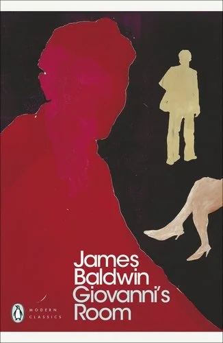
Cover design by Natasha Michaels for James Baldwin, Giovanni’s Room. Published by Penguin
You previously mentioned how you approach printmaking through unconventional techniques and experimentation. Could you talk a bit more about this unconventional method and how it has evolved through your practice?
The cover of James Baldwin’s book I did for Penguin, I made using the technique I developed while I was at art school. Essentially cutting out each silhouette on the plate and then I'd create a scene. While I was doing this, I wasn't interested in faces because obviously if you're making a cover for a book, you want to keep it as open as possible so as not to interfere with the reader’s idea of who the character is. That's how I ended up with those silhouettes and cutting out these characters.
Then I had been making all these drawings and I think the cartoon imagery started coming up for me, partly, because at that point I had a really young child who was starting to look at a lot of cartoon imagery and you're immersed in their world. It was unconscious at first but I think this was the beginning of what was interesting to me.

Affinity, 2022, Monotype, 29.5 x 21 cm, Unique work
What draws you to using monotypes as a method in your practice?
I think it's the spontaneity of it to be honest. On a basic level, I absolutely love the texture you get from a monotype.
I remember doing my first monoprints back in 1989 and loving the process instantly. It's really hard to articulate in some ways what exactly it is but on an intellectual level, it makes sense to me because there's an uncertainty in the process of making. You create this picture, then you put it through a press, and sometimes you get slips and oil smears - it does things that you're not expecting. Sometimes it totally ruins it, frankly. But other times, there's a magical process that happens and you get something better than you started with. You could also argue there is an uncertainty in the things I'm making as well.
There is a resistance in the process, which gives agency beyond the passive surface, both materially and conceptually.
You're not completely in control of the ink and I like that sense of not entirely being in control of the material I'm using, I don't need it to be this perfect thing. I like the process to take something away from my hand in a funny and interesting way. Painting is like this magic substance, in a way, because you can do anything with it - change someone's features and make the most incredible little tiny bit of lace. A lot of painting is about hiding the paint but also, I really love that it's just paint.

Semblance (The curious), 2022, Monotype, 38 x 29 cm, Unique work
You were awarded the Ushaw Residency & Acquisition Prize for Affinity, Semblance (The curious), and Teen (portrait of a young man), which were exhibited at WCPF22. Could you talk more about these artworks and their recurring motifs, such as the large peering eyes of reimagined characters within art historical settings? We have spoken about how your earlier book cover works were like cutouts, which informed your later pieces - cutting these characters out of art history and situating them in their own existential reality.
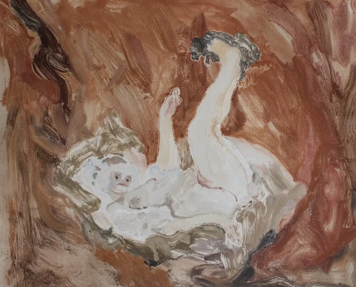
I started off with portraits and that was my original way in. More recently, I found myself drifting over to old masters, like Fragonard and Boucher. I was interested in the context around these artworks, in particular the young girls who worked as models for Boucher who were essentially procured for the King. So when you are looking at these old masters, we're also looking through the male gaze. The original paintings are very voyeuristic and I wanted to make pictures with the subjects looking back out at the viewer, to make them complicit in what they are looking at and about what is being made for them.
In the original Fragonard painting, Curiosity, it's inviting the viewer in and is very enticing. Whereas in Semblance (The curious), I wanted to make something that was kind of saying no and to have the figures staring back out to confront the viewer. By giving them big eyes and changing their faces, it stops being that picture. It's an artwork thinking about painting, I suppose.

Resemblance (The Swing), 2022, Monotype, 92 x 73 cm, Unique work
There are also your artworks such as Dupe (Girl with Dog) and Resemblance (The Swing), which occupy aNOTHER type of space, it’s expansive and different to your other works mentioned that have a cropped or claustrophobic composition. Could you talk more about these different types of spaces?
The Swing is very much about pleasure and about men's pleasure. I wanted this piece to be about her pleasure, essentially. It becomes hers because of the way she's looking and I was making it so she owned that space. It’s a moment she's taking for herself that we aren't supposed to be so privy to. She looks out as if she's being interrupted from that moment by us.
I think a lot of my pictures actually have this idea of interruption. Where there's a pleasure that's being taken, usually women’s pleasure in the old masters paintings, it becomes about the viewer's pleasure instead. I want to swap that around. It should just be about her and her pleasure. Even though they are pleasurable images, in a way, I want there to be something a bit off kilter. They're incredibly sumptuous paintings and they are seductive in so many different ways. I want to play with this seduction and to give back the power to women.
Dupe (Girl with Dog), 2021, Monotype, 51.5 x 43.5 cm, Unique work
There is also a cartoon-like quality in the formal style of the artwork, could you expand on this juxtaposition of old and new styles and its relationship to historic and contemporary portraiture? You have previously described this relationship as an act of ‘vandalism’.
There’s a play between high and low art. The brilliant draughtsmanship in cartoons is an art, there's no two ways about it, and so there is no reason not to push these things together. I do feel like I am vandalising those paintings but I love them so much and there’s something quite irreverent about them. I sort of feel like I'm just some middle-aged Jewish woman from North London and how dare I really? I'm taking on the most revered paintings and I'm getting dirty in the mud with them somehow. I like how I’m seducing people with the ‘original’ but at the same time, pushing them away with my interpretation. I’m infiltrating the world of the original paintings, but also rejecting it.
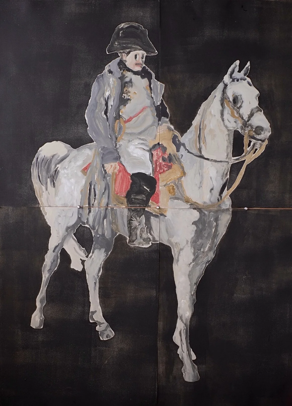
General, 2020, Monotype, 107 x 133 cm, Unique work
You have recently undertaken a 2 week residency at Ushaw Historic House & Gardens as part of the prize. Can you talk about your experience of this residency?
It’s such an extraordinary place. Spending two weeks there, especially after being in London where it's so full on and busy, and then you go to this place that was meant to be hidden from the world. I feel like the actual architecture of the building kept you inside. Partly, I think because of the weather in Durham, if you're there in the middle of winter, you never want to leave that place. Also after a certain amount of time, it became difficult to leave because it felt like there wasn't many doors to the outside world. I suppose that was what the place was, they were trying to keep people out and keep the students in. There was this really strange atmosphere to the whole place and you really got that sense of being a bit ghostly.
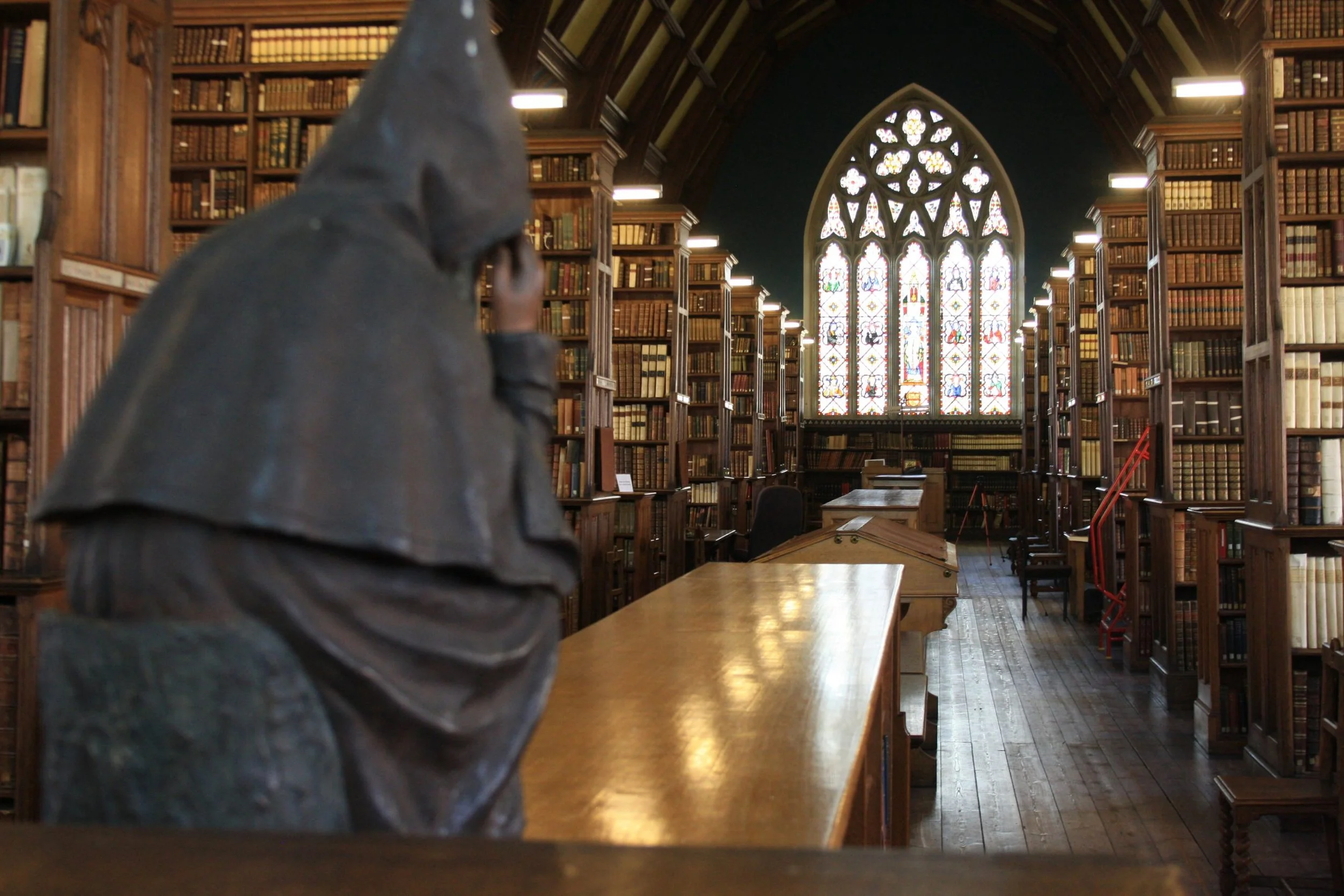
Ushaw’s Library. Image courtesy of Ushaw Historic House, Chapels & Gardens.
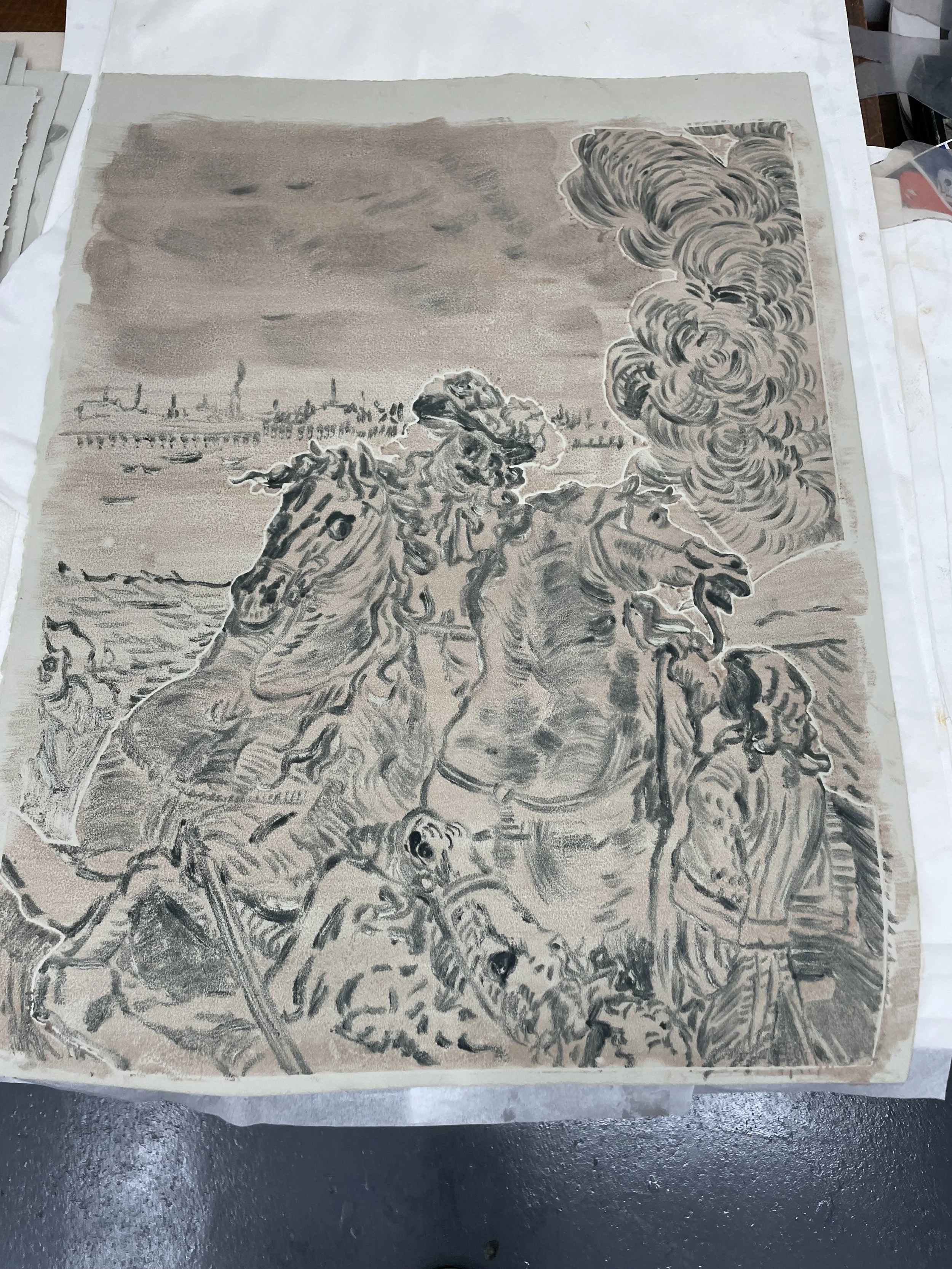
The library is absolutely extraordinary! I'm really so lucky to have been there and seen it and to have been able to talk to Matthew, the Librarian. The books I'm most interested in are about the French Revolution, which were incredible. There was The Cabinet du Roi, which was just an extraordinary piece of work. Volumes of engravings all dedicated to elevating the idea of King Louis XIV. I got a lot from this one. There are some engravings that have Dowie in the background, which is connected to Ushaw College. One in particular, shows someone being killed or a horse being felled to the ground, in the background there are canons aimed at Dowie, while Louis XIV is in the foreground impassively looking on as this act of terror is happening. That one is really interesting and I'm in the middle of making some work using those.
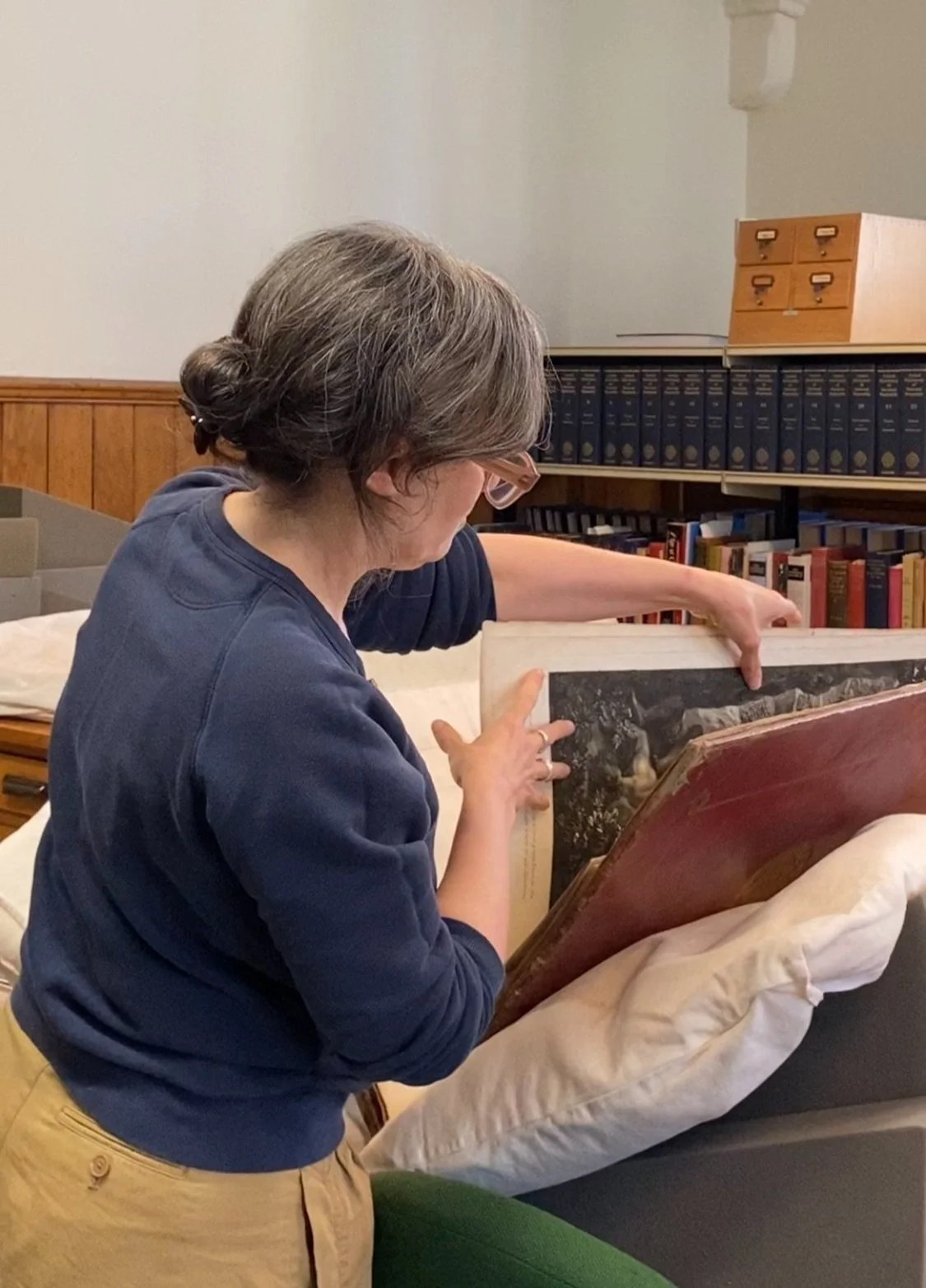
Natasha looking at The Cabinet du Roi, Ushaw Historic House
Do you have a sense of how this residency will inspire and shape the artworks you produce for your showcase at the Fair this October?
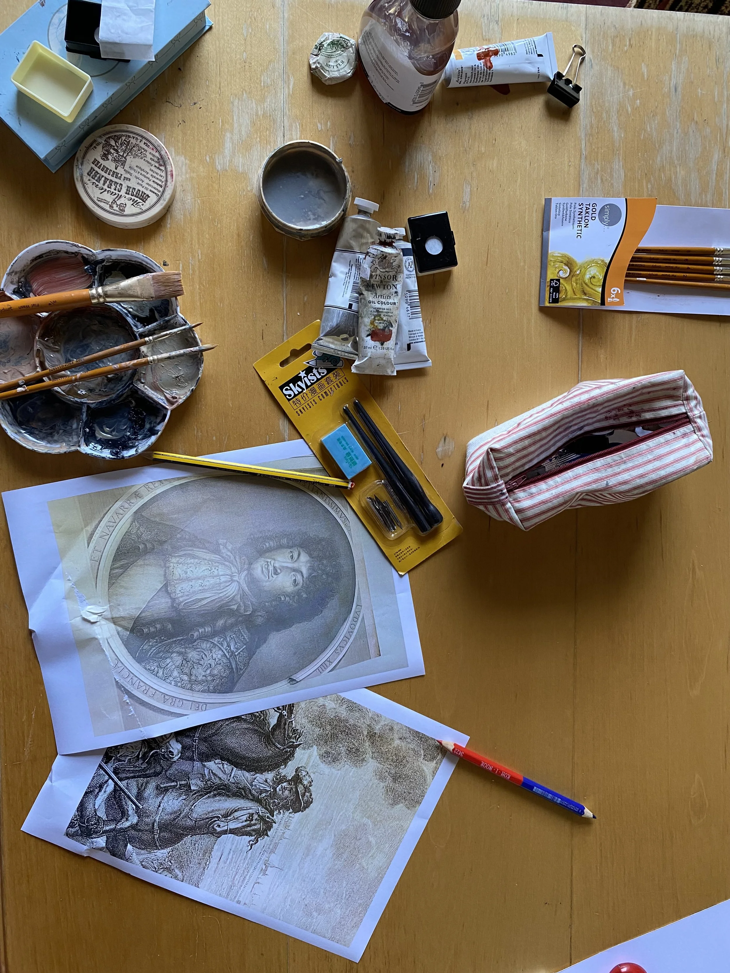
I’ve been drawing onto newsprint. The more I draw the more thoughts come to me as I'm making work. I think eventually it's about what feels right for the actual piece and only then I can start thinking about how I'm going to make that into an actual print. It’s as much about finding the right image as it is doing the drawings. I have to do a lot of them to get to the right image.
There is something also interesting in the scale with The Cabinet du Roi. Some of those engravings are enormous, depicting things like the ceiling of Versailles. There is something interesting in playing with or investigating scale in some way, but I'm not entirely sure yet how I'm going to do this. The unconscious plays a big part, I think this is really important that the work isn’t just describable. The work should be mysterious to the artist too. I hope with all my work, there is some part of it someone else will see that I don’t even know about.
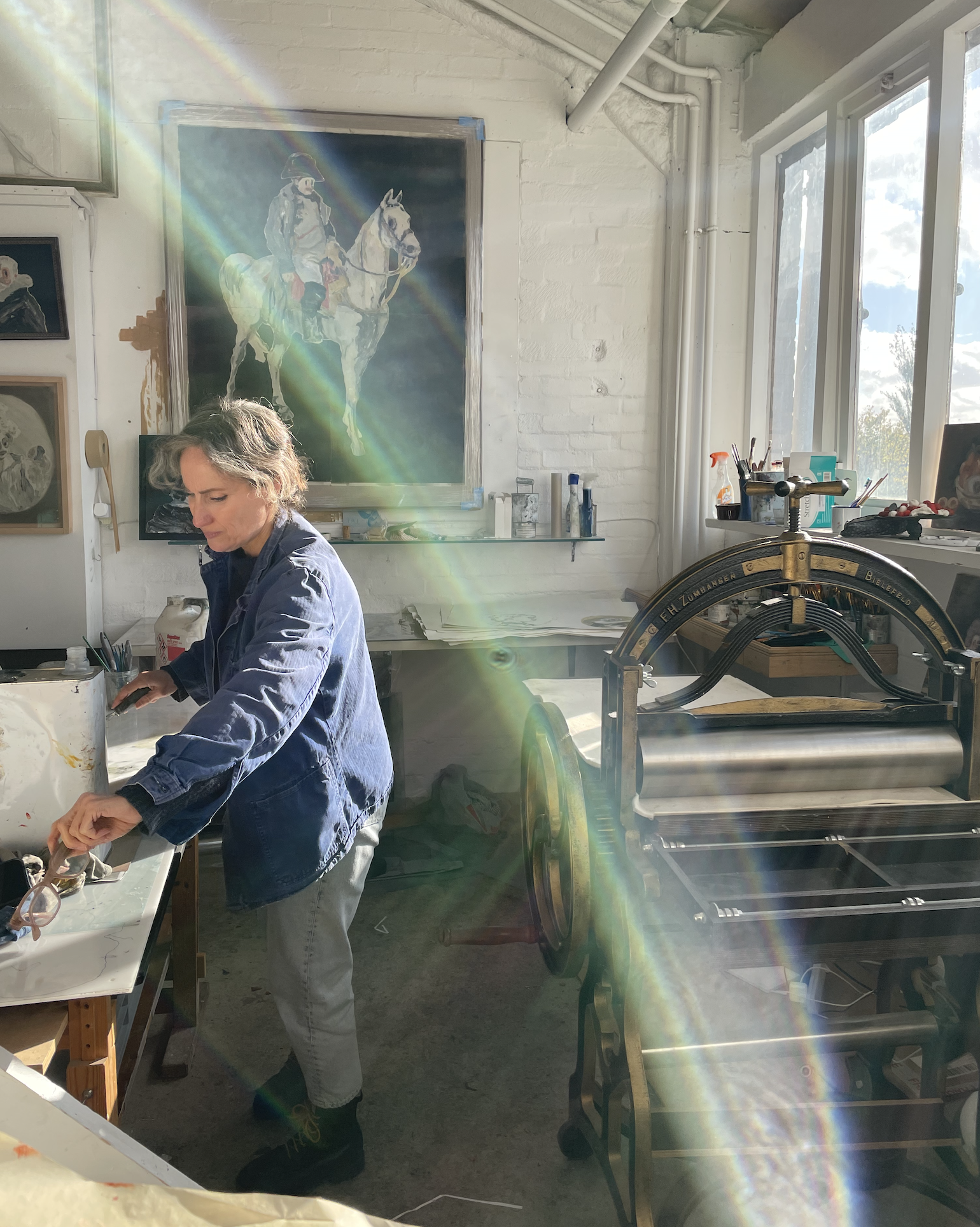
Works-in-progress in Natasha’s studio
I really look forward to seeing how this work will evolve and what takes shape.
Finally, who are your artistic inspirations? How have they influenced the ways you approach your own work?
I'm a magpie! There's all the obvious actual old masters that I'm drawing from but also just thinking back to the early days, when I first started being aware that I wanted to make images, I loved all the AB-EX painters. Even though my work is not abstract, I was drawn to some of the ideas about paint and the material itself. I still love de Kooning. Then going back further, Bonnard and Vuillard for their colour.
I love Joan Mitchell but I never found out about them until much later. I did art history at school and literally never learned about any women artists. I remember being introduced to Joan Mitchell about ten years ago. I was at a drawing class and the teacher had a big book of hers. I looked through and I was like, why do I not know this painter? It was such a mad moment and I realised it’s because she is a woman. I was so shocked. The same with Frankenthaler, I didn't learn about any of them.
Now, there's lots of people who I love, like Lisa Yuskavage and Salman Toor. I think they’re brilliant painters. Although I wouldn't say that I'm directly influenced by them. I think the influence came when I was much younger, when I was starting to learn how to draw and make imagery. There's quite a lot of graphic designers who made really interesting imagery that definitely influenced my aesthetic. But it just all kind of seeps in, doesn't it? Like the cartoons, SpongeBob and The Amazing World of Gumball, they’re brilliant.
Natasha’s studio desk at Ushaw Historic House
Natasha Michaels work will be exhibited at Woolwich Contemporary Print Fair, 26 - 29 October 2023. Details here.
Find more Printmaking Inspiration here.
Discover more printmaking techniques here.
Thanks to our partner Ushaw Historic House, Chapels & Gardens.