
Myles Calvert
£0.00
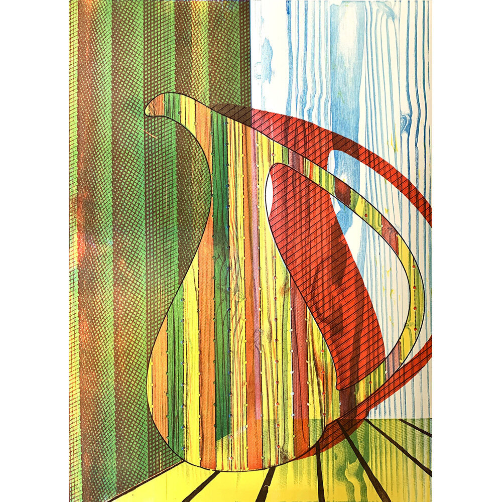
Current work explores the conversations that develop between everyday objects of comfort and colour theory. Ideas navigate the spectrum from utilitarian forms through to the absurdly elevated and opulent. This notion of comfort often escalates to desire and an inherent, materialistic obsession to acquire and adorn. The chosen focal objects have been universal, recognizable and at times, mundane. I question why they must be objects at all, when the broad subject of landscape should also be challenged. My influences are drawn from printmakers such as Richard Hamilton, Patrick Caulfield, and Josef Albers, but also contemporary painters, designers, and digital artists who exceptionally manipulate colour (Flavia da Rin, Anish Kapoor, Mario Testino). Interests are rooted in the ideals of Romanticism - exploration of unique moments and personal emotion through the use of identifiable shape and colour variants. Unique surfaces are explored through print (screenprint, photopolymer etching, laser woodblock, lithography) - specifically, halftone structures and manipulations of those patterns / angles to achieve controllable photographic to distorted variants. The digital glitch present through Adobe software programs drives forward the question of technologies place and developing role in traditional processes. In particular, focus has been on melding traditional woodcut with laser woodcut variants, exploring MDF vs, plywood and plexiglass matrices.
Imagery of recognizable objects, such as toasters, spoons, and ottomans, are combined with specific colour harmonies to suggest a particular emotion based on individual experience. Similar to the ideals of Romanticism, the combination of object and colour reference a unique time period and emotional memory. The experience changes for each viewer based on their life experience to date. Colour palette preferences shift between the biological sexes, with exposure to media trends and influences, and most noticeably with age.
Quantity:
Current work explores the conversations that develop between everyday objects of comfort and colour theory. Ideas navigate the spectrum from utilitarian forms through to the absurdly elevated and opulent. This notion of comfort often escalates to desire and an inherent, materialistic obsession to acquire and adorn. The chosen focal objects have been universal, recognizable and at times, mundane. I question why they must be objects at all, when the broad subject of landscape should also be challenged. My influences are drawn from printmakers such as Richard Hamilton, Patrick Caulfield, and Josef Albers, but also contemporary painters, designers, and digital artists who exceptionally manipulate colour (Flavia da Rin, Anish Kapoor, Mario Testino). Interests are rooted in the ideals of Romanticism - exploration of unique moments and personal emotion through the use of identifiable shape and colour variants. Unique surfaces are explored through print (screenprint, photopolymer etching, laser woodblock, lithography) - specifically, halftone structures and manipulations of those patterns / angles to achieve controllable photographic to distorted variants. The digital glitch present through Adobe software programs drives forward the question of technologies place and developing role in traditional processes. In particular, focus has been on melding traditional woodcut with laser woodcut variants, exploring MDF vs, plywood and plexiglass matrices.
Imagery of recognizable objects, such as toasters, spoons, and ottomans, are combined with specific colour harmonies to suggest a particular emotion based on individual experience. Similar to the ideals of Romanticism, the combination of object and colour reference a unique time period and emotional memory. The experience changes for each viewer based on their life experience to date. Colour palette preferences shift between the biological sexes, with exposure to media trends and influences, and most noticeably with age.


